Spotify has always been one of my favorites when it comes to their poster designs. I not able to find out who created this design, but the location I found this poster is the following URL.
https://www.pinterest.com/pin/537758011742190795/#
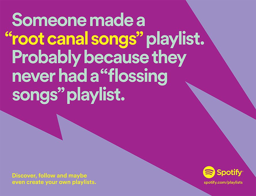
The biggest thing I noticed was the lack of images on this poster. I think it is a great example of effective use of color, contrast, and proper alignment.
Analysis:
The use of color is very bold in this design. Althought I wouldn’t normally think of putting these shades of purple together, it works very well and gives it a retro vibe to the poster. While it was hard to notice, using the color picker I discovered the text that is not yellow is actually not just gray. it is a very light tint of green. While yellow and purple are complementary colors, light green is also very close to yellow and provides a hint of contranst to make the text stand out from the back ground, and give it an original tone.
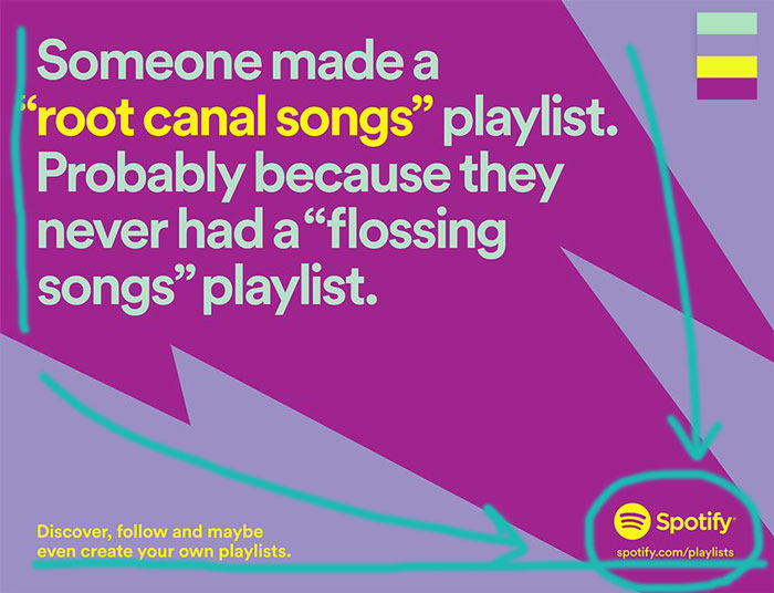
The left alignment (seen in draw over) for the main text gives the poster a strong squared look, which catches the eye. It also matches the sharp lightning-like design in the background, which also does a great job at moving the viewer’s eye to the bottom right corner, where the logo is (arrows in draw over). The logo and the website are grouped together appropriately (seen in draw over). I would imagine the poster would look bad if the website was placed on the top right corner, or anywhere else.
The text on the bottom left adds additional information with a repeated yellow color, to bring the whole design together, filling in a big space on the bottom left that would be rather awkward if left empty. The yellow color used as an accent provides great contrast from the purple background being on the opposite sides of the color wheel. Also, Spotify usually uses the same font for every project, and that repetition brings unity to everything they produce.
Like many of their projects, Spotify isn’t afraid of using shades and tones of colors that other designers might be hesitant to use because it goes against the trend. However, I learned that although Spotify can go against the trend, it follows the basic principles of design in every way.
