Introduction
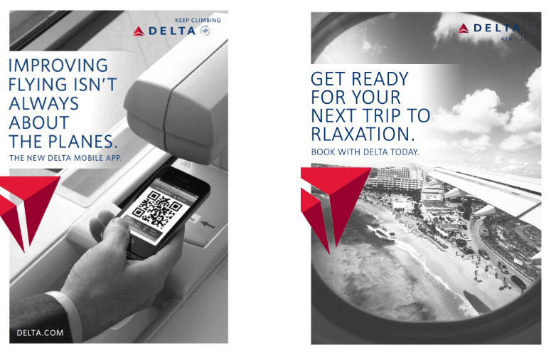
For this assignment I have decided to create an Ad for Delta Airlines. I have always loved seeing Ads from Delta whenever I would be in airports waiting for a connecting flight. The original Ad I chose is from their “Keep Claiming” campaign.
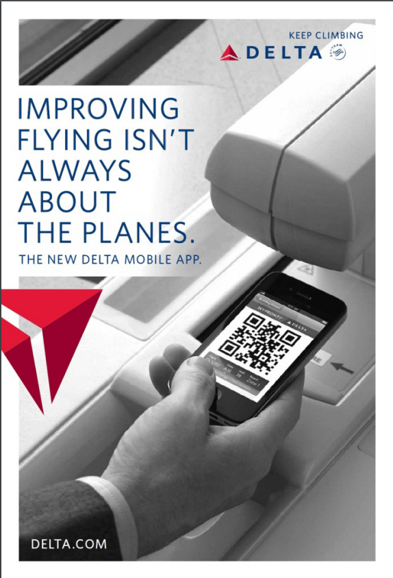

Although the name of the designer is unknown, this ad was found at http://memographer.com/2014/06/happy-birthday-delta-air-lines-magazine-ads-fro m-2010s/. It is an ad that showcases the convenience of using delta’s mobile app.
Original Ad Analysis
Design
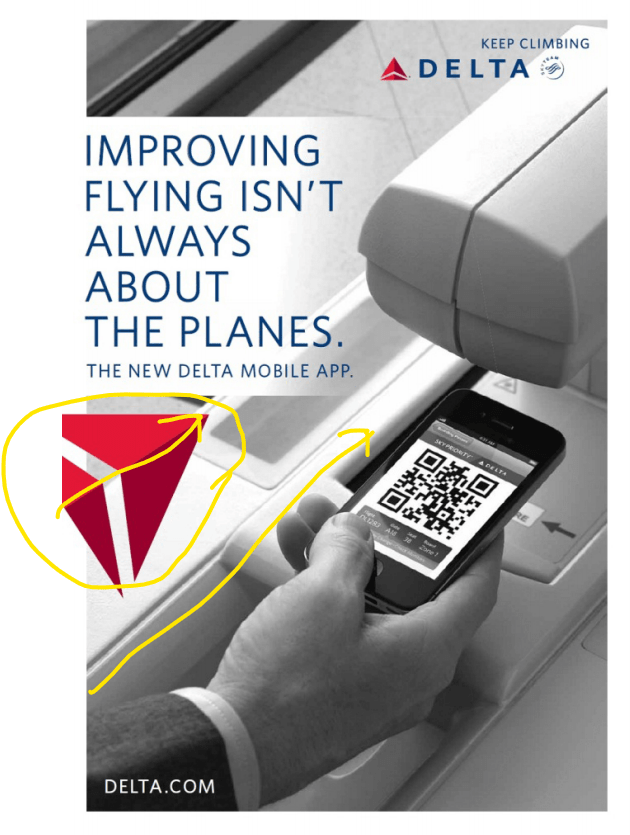
Some things really are done well in the ad. I love the contrast of the bold red logo and the monotone background. It really helps people to recognize the brand, and makes it looks clean. I also think it is amazing they paid attention to detail with the angle of the logo and the angle of the picture matching perfectly. it looks very professional.
Color
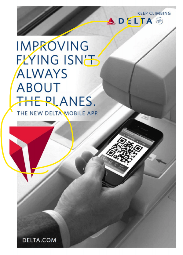
I really like how simple they kept the colors. Their company theme color has great contrast with the navy blue and the red, and it has proven to be a very good combination over the years. It is great they stuck with that. I think they made a smart move by using am image that has a lot of white in the background. It helps the contrast between the text and the background become stronger.
Typography
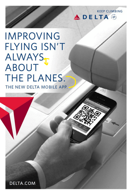
One key feature of the typography in this ad, is the clean sans-serif font, will all caps letters. I think it can be hard to pull off all caps, but they did a great job by keeping the font light-weight, and the spacing narrow. The letters are close together, and line height is short, making the whole typeface evenly spaced. I like the small font they chose for the call to action part. it adds a nice balance to the text and makes it look professional.
My Project Ad Analysis
Design
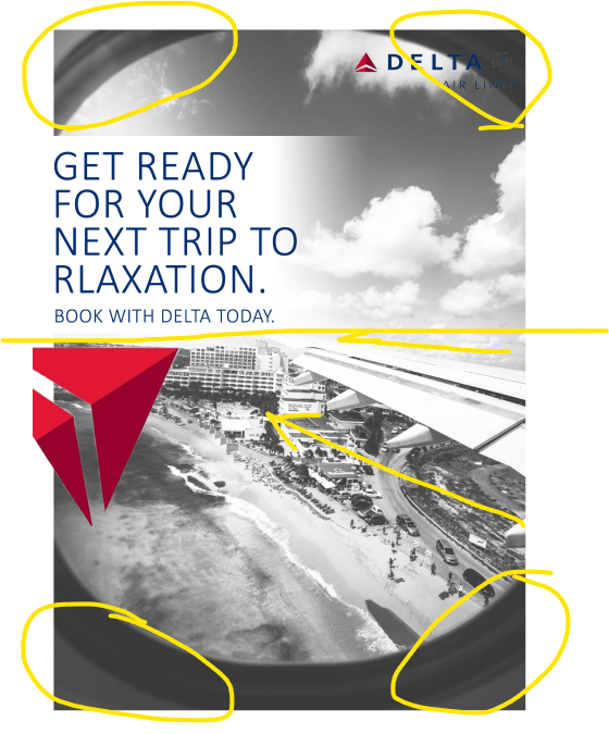
It took me a while to find a good photo to use for this ad. When I found this photo, I though it would work really nicely because it has a strong breaking point right in the halfway point, where the logo and the text is aligned. I also think it does a great job making the ad look three dimensional by keeping the window frame, and using the strong leading lines using the wing. It was a little difficult to create a gradient effect for the background white for the text. but I think it was worth it, it blends with the sky in the picture well.
Color

There is not much of a draw over I can do for the color, because I kept it exactly the same as the ad. I did adjust the brightness of the picture so it wasn’t so dark. That helped the ad looks more like a part of the same series.
Typography

The difficult part about the font was finding one that looked close enough to the original ad. Most font become really fat when the letters are capitalized. So I had to picked a condensed, light font. It was a little tricky deciding where to have the sentence break as well. I decided the third line was right about where the rule of thirds applies, so i made it longer there, hoping it would look balanced. I also noticed I can improve with the company logo text at the top right corner. This might be more of a color issue, but choosing a different color of adding a lighter background might have helped it become more readable.
Conclusion
Even with a simple looking ad with just one picture and mainly two colors, it was amazing to see how much attention to detail is put in. Although when I completed the assignment I felt the ad looked pretty close to the original, when I put it side to side, I still noticed the little differences and color, etc. I learned that in the original ad, the every aspect of the ad is thought out really well to work together. I hope to be able to pay attention to detail like them when I design things myself.
